"Color transforms spaces and affects mood. Master the art of selecting and combining colors to create harmonious, impactful interiors."
The Power of Color
Color is one of the most powerful design tools, influencing mood, perceived space size, and overall ambiance. Understanding color theory helps you create cohesive, beautiful environments.
Color Psychology
Warm Colors (Red, Orange, Yellow)
Create energy, warmth, and intimacy. Perfect for social spaces like dining rooms and living areas. However, they can make rooms feel smaller and more energetic—potentially overwhelming in bedrooms.
Cool Colors (Blue, Green, Purple)
Promote calm, relaxation, and focus. Ideal for bedrooms, bathrooms, and home offices. They make spaces feel larger and more serene but can feel cold in rooms lacking natural light.
Neutral Colors (White, Gray, Beige, Black)
Versatile and timeless, neutrals provide sophisticated backdrops for any style. They allow flexibility in decor and make spaces feel clean and organized.
The 60-30-10 Rule
This classic formula creates balanced color schemes:
- 60%: Dominant color (usually walls)
- 30%: Secondary color (furniture, curtains)
- 10%: Accent color (accessories, art)
Example: Gray walls (60%), navy sofa (30%), gold throw pillows and art (10%).
Color Harmony Methods
Monochromatic
Various shades and tints of a single color create sophisticated, cohesive spaces. Add texture and pattern to prevent monotony.
Analogous
Colors adjacent on the color wheel (blue, blue-green, green) produce harmonious, serene environments. Vary intensity to create depth.
Complementary
Opposite colors on the wheel (blue and orange) create vibrant, dynamic spaces. Use one as dominant and the other as accent for balance.
Triadic
Three evenly spaced colors (red, yellow, blue) offer bold, balanced schemes. Let one color dominate while others provide accent.
Considering Light
Natural Light Direction
- North-facing rooms: Cool light benefits from warm colors
- South-facing rooms: Abundant light handles cooler colors well
- East-facing rooms: Morning light suits warm tones
- West-facing rooms: Afternoon glow flatters cooler shades
Artificial Lighting
Light temperature affects color perception:
- Warm white (2700K-3000K) enhances reds and yellows
- Cool white (3500K-4100K) appears more neutral
- Daylight (5000K-6500K) renders colors most accurately
Room-by-Room Recommendations
Living Room
Neutral bases with colorful accents provide flexibility. Warm neutrals (beige, greige) create welcoming environments for gathering.
Bedroom
Soft blues, greens, and lavenders promote relaxation and sleep. Avoid vibrant reds and bright yellows that stimulate energy.
Kitchen
White, gray, and soft yellows create clean, bright spaces. Darker cabinets with light countertops offer sophisticated contrast.
Bathroom
Spa-like blues and greens or crisp whites create refreshing retreats. Good lighting is essential to prevent colors from feeling dingy.
Home Office
Blues and greens enhance focus and productivity. Yellows stimulate creativity. Avoid overwhelming patterns that distract.
Testing Before Committing
- Sample Large Sections: Paint 2'x2' areas on multiple walls
- Observe Different Times: View samples in morning, afternoon, and evening light
- Consider Adjacent Rooms: Ensure color flow throughout your home
- Test with Furnishings: Hold samples near existing furniture and decor
Common Color Mistakes
- Choosing colors in the store without testing at home
- Ignoring undertones (e.g., "warm" white with "cool" gray)
- Using too many colors (creates chaos)
- Forgetting about ceiling color (can dramatically impact feel)
- Neglecting to consider existing fixed elements (flooring, countertops)
Trending Palettes for 2024
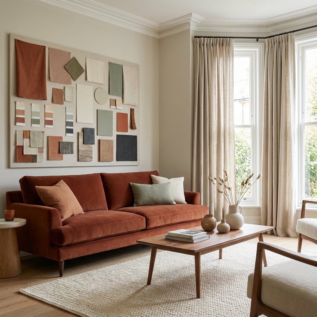
- Earthy Warmth: Terracotta, sage, cream, warm wood tones
- Coastal Calm: Soft blues, sandy beiges, crisp white, natural textures
- Modern Moody: Charcoal, navy, forest green, brass accents
- Scandi Minimalism: White, light gray, black, natural wood
Professional Color Consultation
Selecting the perfect palette can feel overwhelming. MA Interior Design offers color consultation services to help you create harmonious schemes that reflect your personality while maximizing your space's potential.